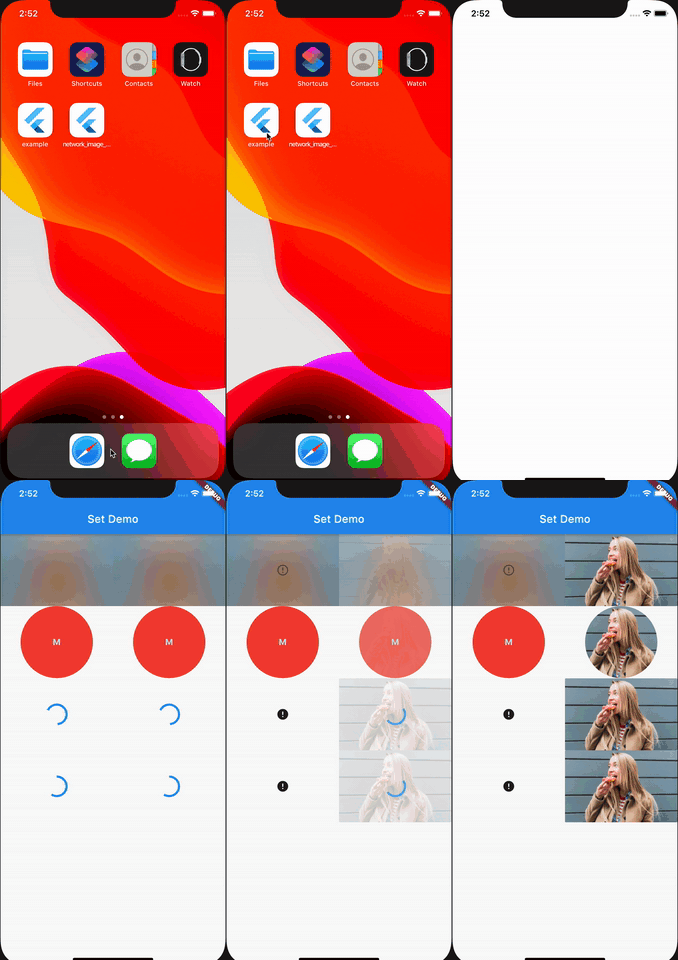
An image library for showing placeholders, error widgets and transform your image.
Recommended using with CachedNetworkImage version 2.2.0 or newer.
The OctoImage widget needs an ImageProvider to show the image. You can either supply the widget with a placeholder or progress indicator, an ImageBuilder and/or an error widget.
However, what OctoImage makes is the use of OctoSets. OctoSets are predefined combinations of placeholders, imagebuilders and error widgets.
So, either set the all the components yourself:
OctoImage(
  image: CachedNetworkImageProvider(
      'https://blurha.sh/assets/images/img1.jpg'),
  placeholderBuilder: OctoPlaceholder.blurHash(
    'LEHV6nWB2yk8pyo0adR*.7kCMdnj',
  ),
  errorBuilder: OctoError.icon(color: Colors.red),
  fit: BoxFit.cover,
);
Or use an OctoSet:
OctoImage.fromSet(
  fit: BoxFit.cover,
  image: CachedNetworkImageProvider(
    'https://upload.wikimedia.org/wikipedia/commons/thumb/4/4e/Macaca_nigra_self-portrait_large.jpg/1024px-Macaca_nigra_self-portrait_large.jpg',
  ),
  octoSet: OctoSet.circleAvatar(
    backgroundColor: Colors.red,
    text: Text("M"),
  ),
);
The CircleAvatar set shows a colored circle with the text inside during loading and when the image failed loading. When the image loads it animates to the image clipped as a circle.
The recommended one is CachedNetworkImageProvider, as that supports the progress indicator, error and caching. It also works on Android, iOS, web and macOS, although without caching on the web. Make sure you use at least version 2.2.0.
The second best is NetworkImage, but any ImageProvider works in theory. However, for some ImageProviders (such as MemoryImage) it doesn't make sense to use OctoImage.
It would be best if you used either a placeholder or a progress indicator, but not both. Placeholders are only building once the image starts loading, but progress indicators are rebuilt every time new progress information is received. So if you don't use that progress indication, for example, with a static image, you should use a placeholder.
The most simple progress indicators use a CircularProgressIndicator.
OctoImage(
  image: image,
  progressIndicatorBuilder: (context) =>
    const CircularProgressIndicator(),
),OctoImage(
image: image,
progressIndicatorBuilder: (context, progress) {
double value;
if (progress != null && progress.expectedTotalBytes != null) {
value =
progress.cumulativeBytesLoaded / progress.expectedTotalBytes;
}
return CircularProgressIndicator(value: value);
},
),However, because these are used so often, we prebuild these widgets for you. Just use OctoProgressIndicator.circularProgressIndicator()
OctoImage(
  image: image,
  progressIndicatorBuilder: OctoProgressIndicator.circularProgressIndicator(),
),
All included placeholders and progress indicators:
| OctoPlaceholder | Explanation |
|---|---|
| blurHash | Shows a BlurHash image |
| circleAvatar | Shows a colored circle with a text |
| circularProgressIndicator | Shows a circularProgressIndicator with indeterminate progress. |
| frame | Shows the Flutter Placeholder |
| OctoProgressIndicator | Explanation |
|---|---|
| circularProgressIndicator | Shows a simple CircularProgressIndicator |
Error widgets are shown when the ImageProvider throws an error because the image failed loading. You can build a custom widget, or use the prebuild widgets:
OctoImage(
  image: image,
  errorBuilder: (context, error, stacktrace) =>
    const Icon(Icons.error),
);OctoImage(
image: image,
errorBuilder: OctoError.icon(),
),All included error widgets are:
| OctoError | Explanation |
|---|---|
| blurHash | Shows a BlurHash placeholder with an error icon. |
| circleAvatar | Shows a colored circle with a text |
| icon | Shows an icon, default to Icons.error |
| placeholderWithErrorIcon | Shows any placeholder with an icon op top. |
Image builders can be used to adapt the image before it is shown. For example the circleAvatar clips the image in a circle, but you could also add an overlay or anything else.
The builder function supplies a context and a child. The child is the image widget that is rendered.
An example that shows the image with 50% opacity:
OctoImage(
  image: image,
  imageBuilder: (context, child) => Opacity(
    opacity: 0.5,
    child: child,
  ),
),
A prebuild image transformer that clips the image as a circle:
OctoImage(
  image: image,
  imageBuilder: OctoImageTransformer.circleAvatar(),
),
All included image transformers are:
| OctoImageTransformer | Explanation |
|---|---|
| circleAvatar | Clips the image in a circle |
You get the most out of OctoImage when you use OctoSets. These sets contain a combination of a placeholder or progress indicator, an image builder and/or an error widget builder. It always contains at least a placeholder or progress indicator and an error widget.
You can use them with OctoImage.fromSet:
OctoImage.fromSet(
  image: image,
  octoSet: OctoSet.circleAvatar(backgroundColor: Colors.red, text: Text("M")),
),
All included OctoSets are:
| OctoSet | Explanation |
|---|---|
| circleAvatar | Shows a colored circle with text during load and error. Clips the image after successful load. |
| circularIndicatorAndIcon | Shows a circularProgressIndicator with or without progress and an icon on error. |
You can easily create your own OctoSet though, for example if you want to use blurHash as a placeholder:
/// Simple set to show [OctoPlaceholder.circularProgressIndicator] as
/// placeholder and [OctoError.icon] as error.
OctoSet blurHash(
  String hash, {
  BoxFit? fit,
  Text? errorMessage,
}) {
  return OctoSet(
    placeholderBuilder: blurHashPlaceholderBuilder(hash, fit: fit),
    errorBuilder: blurHashErrorBuilder(hash, fit: fit),
  );
}

OctoPlaceholderBuilder blurHashPlaceholderBuilder(String hash, {BoxFit? fit}) {
  return (context) => SizedBox.expand(
    child: Image(
      image: BlurHashImage(hash),
      fit: fit ?? BoxFit.cover,
    ),
  );
}


OctoErrorBuilder blurHashErrorBuilder(
  String hash, {
  BoxFit? fit,
  Text? message,
  IconData? icon,
  Color? iconColor,
  double? iconSize,
}) {
  return OctoError.placeholderWithErrorIcon(
    blurHashPlaceholderBuilder(hash, fit: fit),
    message: message,
    icon: icon,
    iconColor: iconColor,
    iconSize: iconSize,
  );
}If you would like to contribute to the plugin (e.g. by improving the documentation, solving a bug or adding a cool new feature), please carefully review our contribution guide and send us your pull request.
PR's with any new prebuild widgets or sets are highly appreciated.
- Feel free to open an issue. Make sure to use one of the templates!
- Commercial support is available. Integration with your app or services, samples, feature request, etc. Email: [email protected]
- Powered by: baseflow.com

